BRANDING
This is my brothers crop dusting company, he had asked me to create a new logo for him. He wanted a more polished and professional look from the first logo design a company proposed to him.
Agricultural crop dusting is a specialized field that involves precision, efficiency, and environmental awareness. Therefore, your logo should communicate these values while distinguishing your company from competitors. Incorporating elements such as aerial crop spraying equipment, farm landscapes, or stylized crop patterns can evoke a sense of expertise and reliability.
OLD LOGO
Building upon the foundation of the existing logo proposal, I aimed to enhance its impact by aligning it more closely with the actual plane used in crop dusting while maintaining the favored font for continuity. The goal is to create a visual identity that authentically represents his agricultural crop dusting services while ensuring clarity and distinctiveness.
INSPIRATION
My initial approach to logo design begins with comprehensive research into existing logos within the agricultural crop dusting industry. By examining a range of logos that resonate with me, I draw inspiration for developing a distinctive design that captures the essence of his business. It's crucial to understand how other companies differentiate themselves as agricultural crop dusting specialists, rather than merely aviation-focused entities. This process guides me in identifying effective elements such as agricultural motifs, unique color schemes, and symbolic representations of crop dusting operations. Through this research-driven approach, I aim to create a logo that not only stands out within the industry but also effectively communicates his specialized expertise and commitment to agricultural services.
FINAL THREE DESIGNS
I decided to emphasize the letter "B" by transforming it into an iconic element that can be used either with accompanying text or as a standalone symbol. This approach opens up various design possibilities. Initially, I aimed to create a sense of movement into the plane, pulling it away from the "B". While sharp lines conveyed speed, the design still felt overly focused on aviation rather than agricultural aspects. In exploring alternatives, I experimented with a row effect reminiscent of crop rows and the dispersal pattern of dust during a plane's banking maneuver.
COLOR OPTIONS
After extensive discussions, we settled on the row crop logo as our preferred design direction and proceeded to explore color options. Initially considering yellow for the plane and green for the crops, we hesitated because this color combination is closely associated with John Deere equipment in the agricultural industry. Reflecting on the colors already present on his plane, we also considered incorporating blue from the sticker decals. However, combining yellow, blue, and green proved too visually crowded. The blue felt particularly out of place and evoked unintended associations, reminiscent of Garst Seed Company's branding.
FINAL LOGO
For the final logo, I opted to round off the top corner of the "B" to create a smoother line. We selected green and yellow as our colors of choice. My rationale behind this decision was to use the yellow and green color way, was that the shape of the "B" and the plane distinctly differentiated our logo from John Deere, and it doesn’t hurt to use colors commonly associated with the agricultural industry. This approach was especially important considering the plane's yellow color and the predominant green of the crops he services.
BUSINESS CARDS
FRONT
BACK
For the business cards, I recommended incorporating rounded corners to echo the smooth shape of the "B" icon. Additionally, I proposed enhancing the design with curved shapes inspired by row crops, extending these patterns to the corners of the card. This approach not only ties in with the logo's visual elements but also adds a touch of consistency to the overall design.
MAILER & WEB AD
Building on the concept of the business cards, I aimed to extend the row crop corner motif to both online and printed advertisement mailers. Consistency in design was key to reinforcing a strong and cohesive brand identity from the start. By carrying over this visual theme across different mediums, we ensure that the branding remains recognizable and impactful, creating a unified brand experience for our audience.
SOCIAL
We decided to initially focus our social media presence on Facebook, recognizing that many farmers in the area, who are often older, prefer this platform. Running the design of his mailer ad as a paid Facebook ad generated significant interest. In addition to promotional content, he shared a series of progress photos detailing his journey—from working on an older crop dusting plane to acquiring new equipment, obtaining crop dusting and application licenses, and developing his ideal fertilizing and fuel trailer.
Moving forward, he plans to establish a presence on TikTok to increase visibility and educate the public on the importance of crop protection in a safe and efficient manner. This strategy aims to raise awareness about his company while showcasing his expertise in agricultural services.
TRUCK WRAP
Creating a truck wrap was crucial as it serves as a mobile advertisement for his company. While he operates in the air, spraying fields, the truck, parked on the landing strip and transporting chemicals, informs people about his presence and operations in field spraying. This wrap ensures visibility and brand recognition, making it clear who is responsible for aerial crop spraying in the area.
SWAG
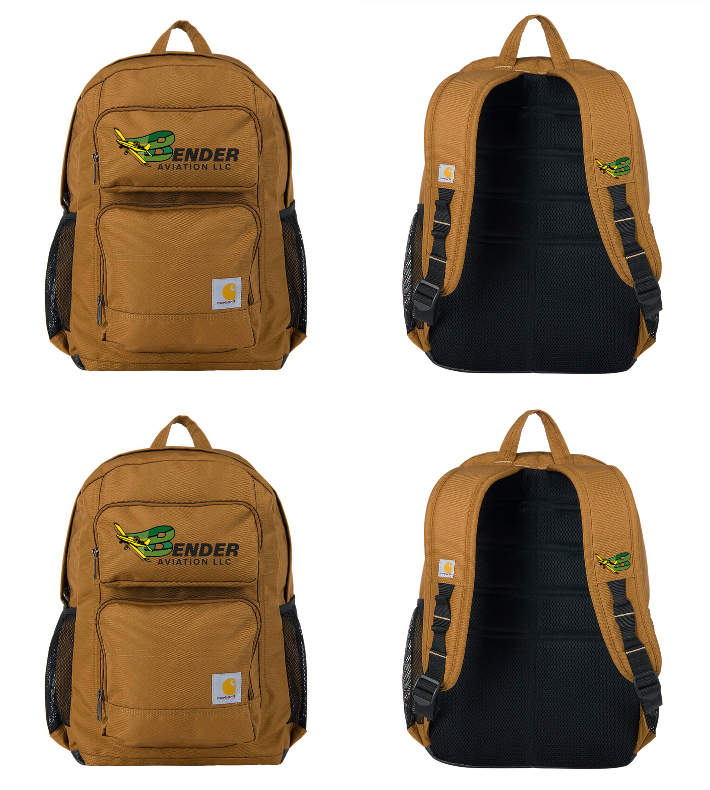
As a crop dusting application specialist, he faces space constraints within the plane, making a backpack essential for keeping items easily accessible. Recognizing its practicality, we decided that if he finds it useful, other farmers would likely appreciate a similar backpack to carry essentials from tractor to truck to combine while working in the field. Alongside backpacks, we also considered offering t-shirts, hats, and jackets, which would not only be used by him and his employees but also given as thank-you gifts to his customers. This branded swag serves dual purposes: practical utility for farmers and effective promotion as recipients become walking advertisements, spreading awareness of his services throughout the agricultural community.


